Whenever a dataset has location info, I like to start with a map.

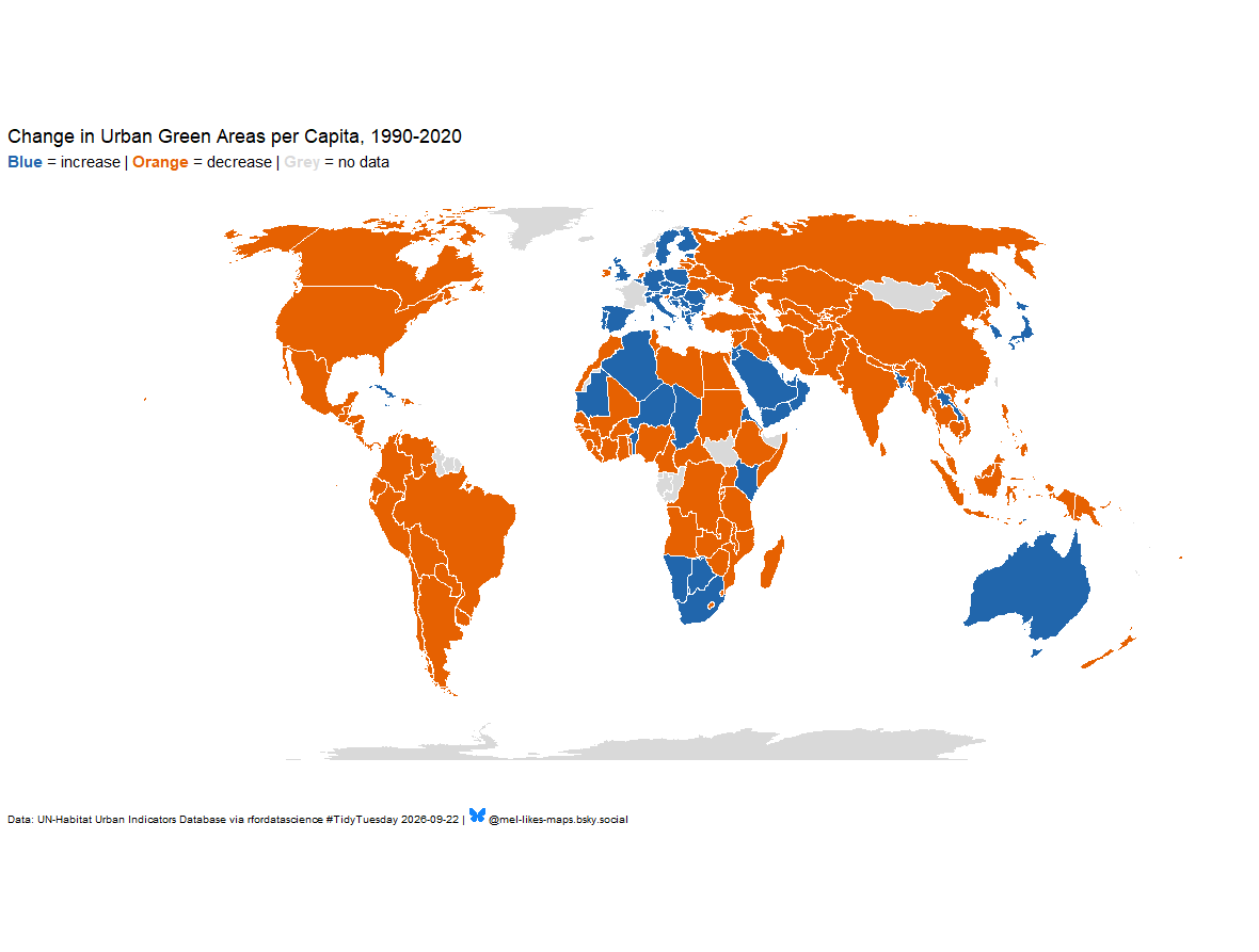
This week’s #TidyTuesday data tracks urban green space since 1990 — and it’s global. First cut looks like it is trending toward less green area per person worldwide. #rstats #dataviz #rspatial
github.com/mhegeman/…

World map in an equal-area projection showing whether a country's urban green area per capita has increased or decreased since 1990. Countries with an increase in urban green area per capita from 1990 to 2020 are shown in blue, while those with a decrease are shown in orange. Countries without data are in gray.